
| 일 | 월 | 화 | 수 | 목 | 금 | 토 |
|---|---|---|---|---|---|---|
| 1 | 2 | 3 | 4 | 5 | 6 | |
| 7 | 8 | 9 | 10 | 11 | 12 | 13 |
| 14 | 15 | 16 | 17 | 18 | 19 | 20 |
| 21 | 22 | 23 | 24 | 25 | 26 | 27 |
| 28 | 29 | 30 | 31 |
- LLM
- firebase
- 단축키
- Flutter
- java 출력
- nodejs
- DART
- java 콘솔 출력 차이
- printf
- 자바 출력 방식
- 배포
- ListView
- JQ
- 앱심사
- riverpod
- JS
- develop
- 자바스크립트
- println
- 엡
- react
- 자바 포맷 출력
- Clean Architecture
- lifecycle
- npm
- UI/UX
- java
- unity
- scss
- abap
- Today
- Total
guricode
Flutter의 기능성 위젯 본문
1.Text 위젯

Text위젯은 화면에 문자열을 표시하기 위젯이다.
Text위젯에 사용되는 스타일 옵션 정리
fontSize
텍스트의 크기를 설정합니다.
fontWeight
텍스트의 굵기를 설정합니다.
color
텍스트의 색상을 설정합니다.
letterSpacing
텍스트의 문자 간격을 설정합니다.
wordSpacing
텍스트의 단어 간격을 설정합니다.
decoration
텍스트의 장식을 추가합니다. (밑줄, 취소선 등.. )
fontFamily
텍스트의 글골을 설정합니다.
사용 예제
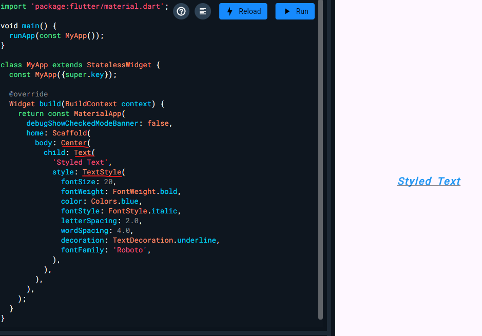
사용되는 형태는 Text위젯 안에서 TextStyle 적용한다
import 'package:flutter/material.dart';
void main() {
runApp(const MyApp());
}
class MyApp extends StatelessWidget {
const MyApp({super.key});
@override
Widget build(BuildContext context) {
return const MaterialApp(
debugShowCheckedModeBanner: false,
home: Scaffold(
body: Text(
'Styled Text',
style: TextStyle(
fontSize: 20,
fontWeight: FontWeight.bold,
color: Colors.blue,
fontStyle: FontStyle.italic,
letterSpacing: 2.0,
wordSpacing: 4.0,
decoration: TextDecoration.underline,
fontFamily: 'Roboto',
),
),
),
);
}
}
2.TextField위젯
입력 폼에 해당하는 위젯
자주사용되는 옵션
- maxLength
- 사용자가 입력할 수 있는 최대 문자 수를 설정합니다.
- readOnly
- 텍스트 필드를 읽기 전용으로 설정하여 사용자가 텍스트를 수정할 수 없도록 합니다.
- textAlign
- 텍스트의 정렬 방식을 설정합니다.
- decoration
- 텍스트 필드의 장식을 설정합니다. 레이블, 힌트 텍스트, 아이콘 등을 포함할 수 있습니다.
- controller
- 텍스트 필드의 상태를 제어하는 컨트롤러를 설정합니다. 텍스트를 읽고 쓰거나 텍스트 필드의 상태를 관리할 수 있습니다.
사용예제
import 'package:flutter/material.dart';
void main() {
runApp(MyApp());
}
class MyApp extends StatelessWidget {
@override
Widget build(BuildContext context) {
return MaterialApp(
home: Scaffold(
appBar: AppBar(title: Text('TextField Example')),
body: Padding(
padding: const EdgeInsets.all(16.0),
child: MyCustomForm(),
),
),
);
}
}
class MyCustomForm extends StatefulWidget {
@override
_MyCustomFormState createState() => _MyCustomFormState();
}
class _MyCustomFormState extends State<MyCustomForm> {
final TextEditingController myController = TextEditingController();
@override
void initState() {
super.initState();
myController.addListener(() {
//initState에 이벤트를 정의, 입력될때마다 콘솔에 출력됨
print(myController.text);
});
}
@override
Widget build(BuildContext context) {
return Column(
children: <Widget>[
TextField(
maxLength: 20,
readOnly: false,
textAlign: TextAlign.left,
decoration: InputDecoration(
labelText: 'Enter your name',
hintText: 'John Doe',
border: OutlineInputBorder(),
counterText: '', // This hides the counter below the TextField
),
controller:
myController, //클래스 내부에 TextEditingController를 생성해서 변수로 할당받는 변수명, Text 영역에 사용했음
),
SizedBox(height: 20),
ElevatedButton(
onPressed: () {
// 텍스트 필드의 값 출력
print(myController.text);
},
child: Text('Submit'),
),
],
);
}
@override
void dispose() {
myController.dispose();
super.dispose();
}
}
3. switch
무언가를 켜고 끄게 할 수 있는 위젯
클릭해서 바뀌는 이벤트는 상태관리 부분에서 학습하기
import 'package:flutter/material.dart';

void main() {
  runApp(const MyApp());
}

class MyApp extends StatelessWidget {
  const MyApp({super.key});

  @override
  Widget build(BuildContext context) {
    return MaterialApp(
      debugShowCheckedModeBanner: false,
      home: Scaffold(
        body: Center(
          child: Switch(
            value: true,
            onChanged: (bool newValue) {
              // 토글 이벤트 처리
            },
          ),
        ),
      ),
    );
  }
}
4.Slider
프로그레스바를 올린다거나 범위 내에서 조절할때? 사용한다
import 'package:flutter/material.dart';

void main() {
  runApp(const MyApp());
}

class MyApp extends StatelessWidget {
  const MyApp({super.key});

  @override
  Widget build(BuildContext context) {
    return MaterialApp(
      debugShowCheckedModeBanner: false,
      home: Scaffold(
        body: Center(
          child: Slider(
            value: 50,
            min: 0,
            max: 100,
            onChanged: (double newValue) {
              // 슬라이더 변경값에 따른 이벤트 처리
            },
          ),
        ),
      ),
    );
  }
}
5.GestureDetector
모든 제스쳐를 감지할수있는 위젯
옵션
- onTap
- 사용자가 위젯을 탭할 때 호출되는 콜백 함수
- onLongPress
- 사용자가 위젯을 길게 누를 때 호출되는 콜백 함수
- onDoubleTap
- 사용자가 위젯을 더블 탭할 때 호출되는 콜백 함수
- behavior
- GestureDetector의 동작 방식을 정의합니다. 이 옵션을 통해 제스처 감지의 범위와 방식에 영향을 줄 수 있습니다. HitTestBehavior 열거형의 세 가지 값 중 하나를 선택할 수 있습니다: deferToChild, opaque, translucent.
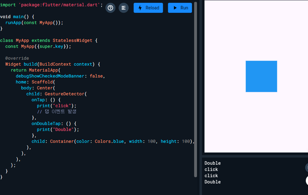
import 'package:flutter/material.dart';

void main() {
  runApp(const MyApp());
}

class MyApp extends StatelessWidget {
  const MyApp({super.key});

  @override
  Widget build(BuildContext context) {
    return MaterialApp(
      debugShowCheckedModeBanner: false,
      home: Scaffold(
        body: Center(
          child: GestureDetector(
            onTap: () {
              print("click");
              // 탭 이벤트 발생
            },
            onDoubleTap: () {
              print("Double");
            },
            child: Container(color: Colors.blue, width: 100, height: 100),
          ),
        ),
      ),
    );
  }
}
6.image
이미지를 불러오는 위젯
프로젝트 내의 이미지 에셋을 이용해도 좋고 URL을 사용할수도 있다.
 ....

 Scaffold(
  backgroundColor: Colors.blue,
  body: Center(
    child: Image.network(
      'https://sudar-life.github.io/images/logo_white_mode.png',
      width: 200,
      height: 200,
    ),
  ),
),

....
'앱 > Flutter&Dart' 카테고리의 다른 글
| appBar에서 타이틀이 가운데 정렬 되지 않을때 (0) | 2025.06.19 |
|---|---|
| 상태관리의 정의와 setState의 한계 (1) | 2025.06.19 |
| Stack & Positioned (0) | 2025.06.17 |
| Stateless,Stateful/ view 위젯/레이아웃 (0) | 2025.06.17 |
| Dart 공부 정리 - 타입 / 함수 파라미터 / 동기 비동기 (1) | 2025.06.16 |


